
Brand Design
Guidelines
With a new name comes a new logo, and we are also updating our typography, colour palette and other graphic design principles to reflect the future-facing nature of the new combined company.


Primary Logo
Our primary logo spells out our name in full including the superscript m. This should be used in most cases. Exceptions include very small applications like social media avatars.
The logo can be black or white, never in colour, but can be placed on colour or images as long as it reads clearly.
Placement
When centering the logo in a space, use the centre of the circle as a reference. Don’t simply centre the logo according to its total width.


Primary Logo Position.
In most applications we prefer the logo to be positioned top-left. But, for video endframes, signage etc it is more appropriate to place it centrally. When placing the logo in the centre, use the circle as the reference point, not the width of the logo.
Secondary Logo
For now, the secondary logo should only be used for very small applications, eg social media account avatars.
Like the Primary Logo, it can only ever appear in black or white.


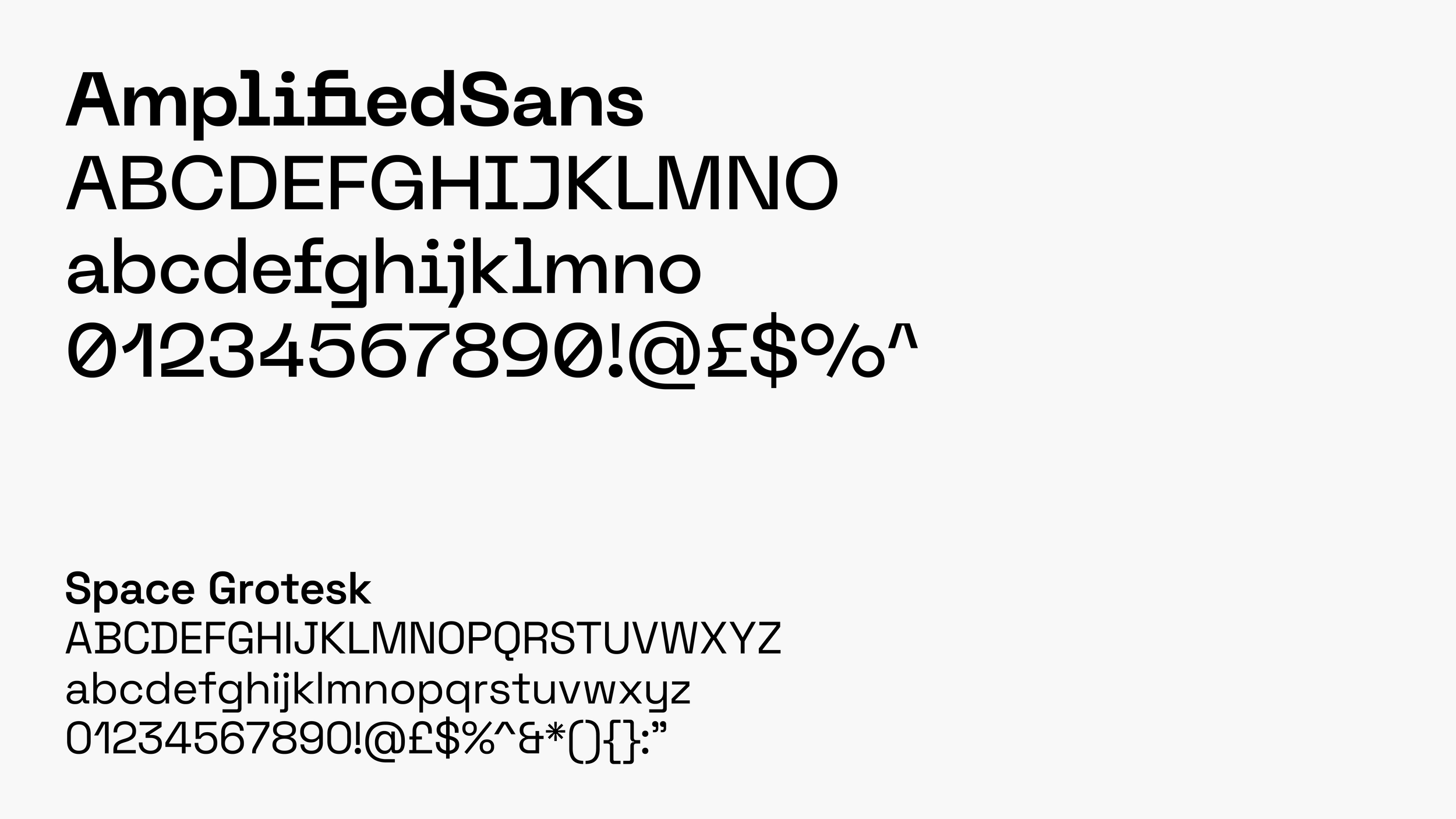
Typography
We have two fonts:
Amplified Grotesk is our primary font and unique to our brand. It is used in our logo and must be used for all touchpoints which have permanence, high external visibility or impact. Eg, logos, signage, merchandise, materials for events, stationery, websites. This font is currently only available to our Design teams but will be rolled out across the business in April 2024.
Space Grotesk is our secondary font. It is used for day to day materials like Google Docs and Slides, but also used as small body on websites and printed documents.
Bear with us — This will be clearer when Amplified Grotesk is available.
If you need an advance copy of Amplified Sans please email dan.beckett@tandpgroup.com for the password.
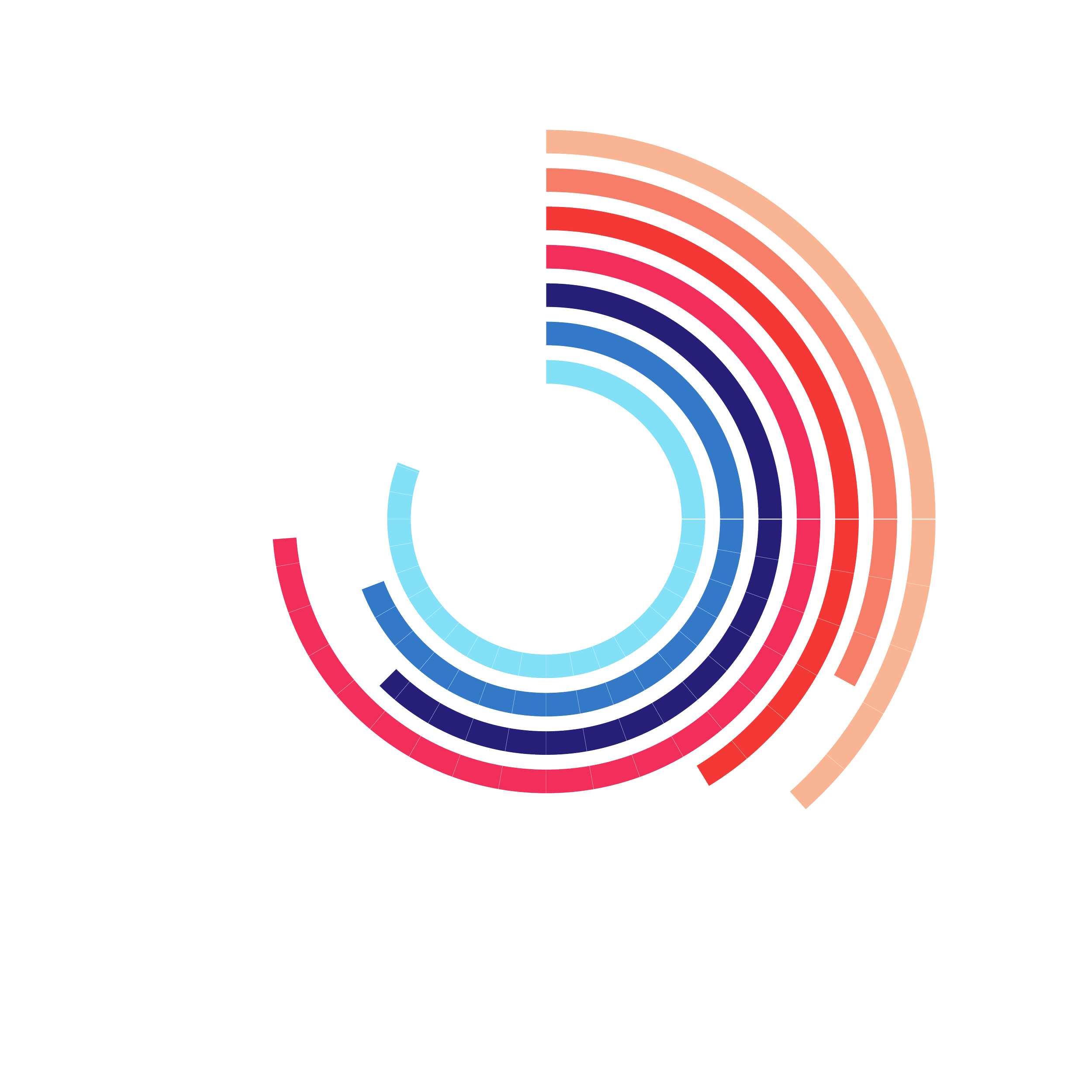
Colour
Our logo is only seen in black or white, but we have an extensive secondary palette of colours to help make our work eye-catching, vibrant and easier to navigate.
Colours can be combined to create contrast or harmony, in solid or in gradients. Colour should be applied sparingly to typography which in most cases we prefer to be black or white.
If in doubt, start with the blue section of the palette.


&Template 25
The presentation template designed for everyday presentations.
Uses include daily internal meetings, project updates and new business presentations.


&Template 25 Max
The presentation template designed for all-agency showcases.
Uses include &Together, Creative Showcases, Global Townhalls, and bigger screens.


&Data Template
The presentation template designed for data reporting and data-driven storytelling.
Uses include presenting dashboards, performance metrics, and data strategy.


Google Doc Template
Use the Google Doc template for text-focused documents, press releases, long scripts, etc.
The template contains preset heading and paragraph styles to help organise information, along with instructions on how to use them.
